Fast Checkout. Complex Groups. Zero Compromise
Role: Product Manager & Product Designer
Team: 4 Engineers
Redesigning how a reservation is created in the platform by creating a customized experience that meets the needs of the simplest point of sale transaction all the way to a complex and customized itinerary.
Problem
The current reservation system has a fragmented interface that forces users to navigate between multiple tabs, causing confusion and missed steps. This complex workflow makes it difficult for companies to train seasonal staff and doesn't accommodate the diverse needs of users, from simple ticket vendors to hunting lodges requiring complex itinerary building. Additionally, the one-size-fits-all approach fails to accommodate the diverse range of user needs, from high-volume ticket vendors who simply need to add items to a cart and checkout, to full-service hunting lodges that require sophisticated tools for building complex guest itineraries and everything in between. The result is booking abandonment, increased training costs, and poor user experience across different business types.
Research
Before I could start designing I had several questions I needed answered:
What steps in the booking process were critical to keep and what steps could we remove without consequence?
What is the most common workflow?
Are there any bottle necks we can alleviate?
To gain insight I took several routes:
Research the training materials our Onboarding Team provides to new accounts. What are we training and prescribing accounts to do? Understand if this is the best way to create a reservation OR if this is the process because it’s what the software dictates.
Survey. I created a survey that was shared to all accounts in the platform. This survey asked a series of questions about their booking process and focused on details about what their order of operations was based on their role (front desk, group sales, operations, etc.). I also wanted to learn more about how and when they were collecting waivers, and if they are printing tickets or wristbands where that is in the process.
Lastly, I conducted interviews with some of our larger accounts that handle a high volume of walk-up customers. This was the group I was mostly interested in and wanted to learn how I could shave off a few seconds or potentially minutes for creating these reservations. If I could create an efficient booking flow for these operators then I could create a smooth flow for all of our operators.
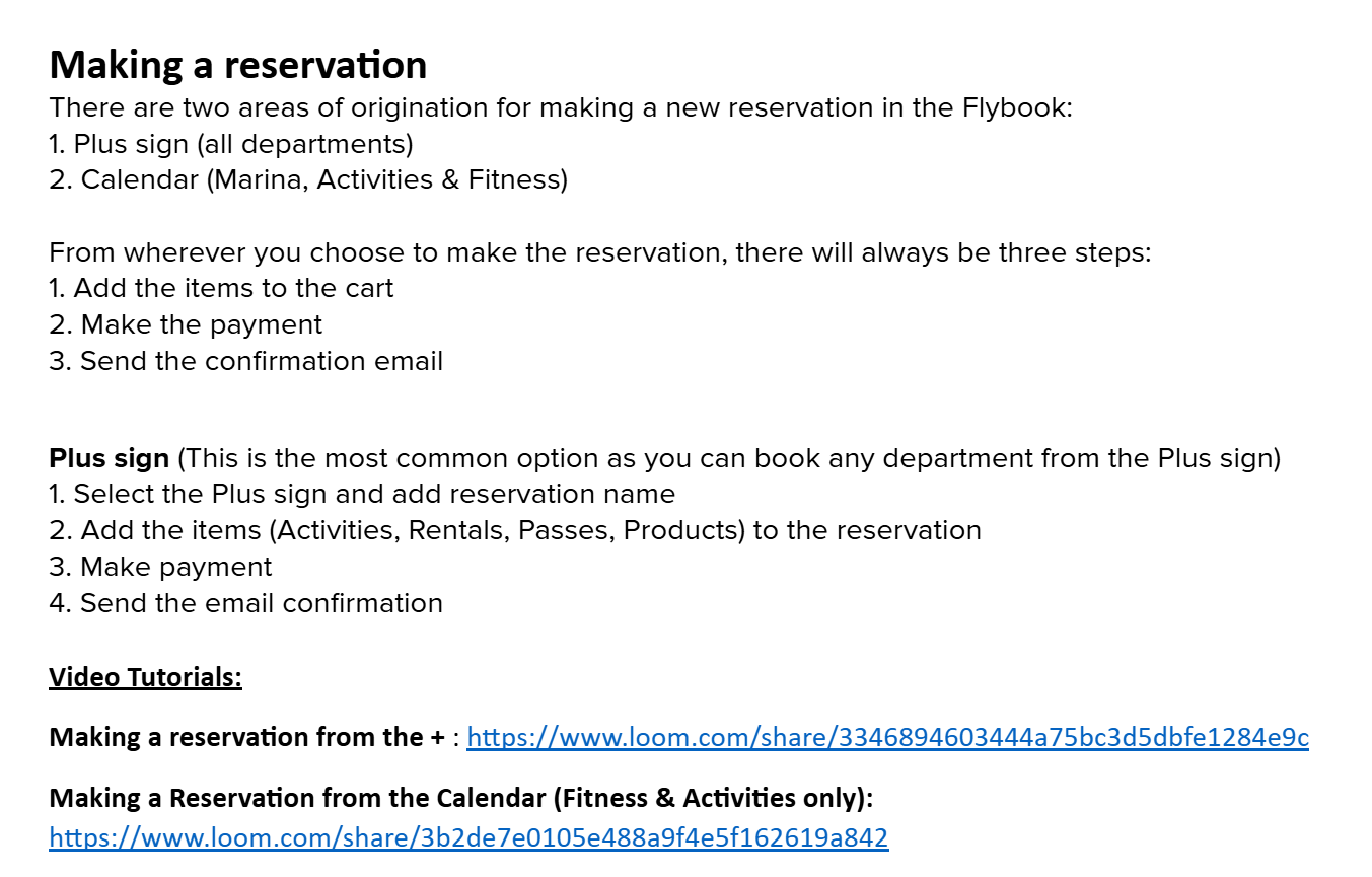
Training Materials
The Onboarding Team will create a step by step process for creating a reservation. These are often standard, but could have extra steps based on the needs of the operator.
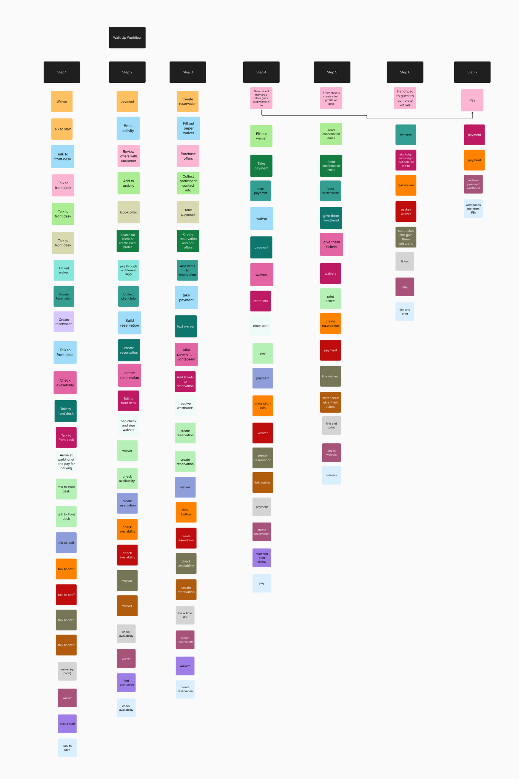
Interview with high volume walk-up operators
My focus for these operators were to gain a clear picture of how and when they are collecting waiver. I also wanted to identify bottlenecks that we could potentially alleviate.
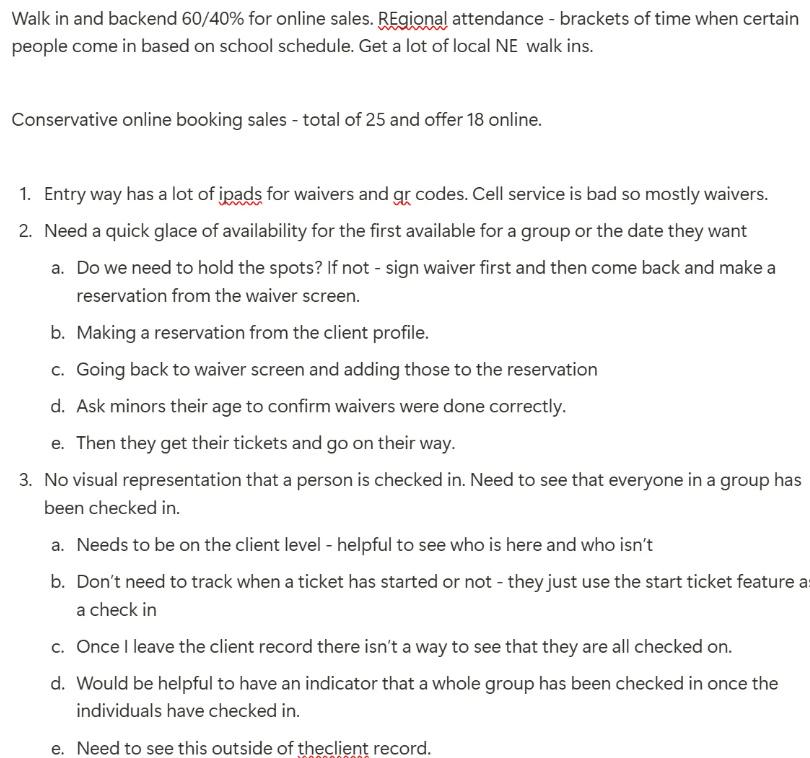
Data Mapping from the Survey
Once I had the survey results I started mapping the most common workflows and order of operations for each account.
Synthesizing Data
Once the data is collected it’s time to turn it into a digestible state. I like to create a presentation that includes charts and graphs of the data collected. I also highlight the problems that need to be solved as well as any requirements that have come out of the investigation. Lastly, I will include personas for each user group I’ll be designing for.
MVP Design Needs
In the current reservation booking flow, creating a reservation and managing it were combined into one workflow. This new approach will separate these two operations. First the user will create the reservation and focus on only the steps required. The management piece will come after the reservation has been created and will include any and all steps necessary to track and manage a reservation.
The creation of reservation needs to meet the needs of various operators and roles within those operations. To accomplish this goal there are some key requirements:
Flexible workflow that allows customization and provides an intuitive workflow.
Ability to support workflows ranging from a simple point-of-sale transaction, such as adding an item to a cart and taking payment, to complex reservations involving multiple offers for large groups of hundreds of customers.
Overhaul how offers are add to the cart by reducing clicks and making a streamlined approach.
Beautiful interface to bring the experience from 1999 to 2025
Mobile Friendly!
Most users are creating reservation from a desktop or a walk-up area at their facility. However, we do have on the go users who need the ability to easily make a reservation from their phone.
North Star
Use Case
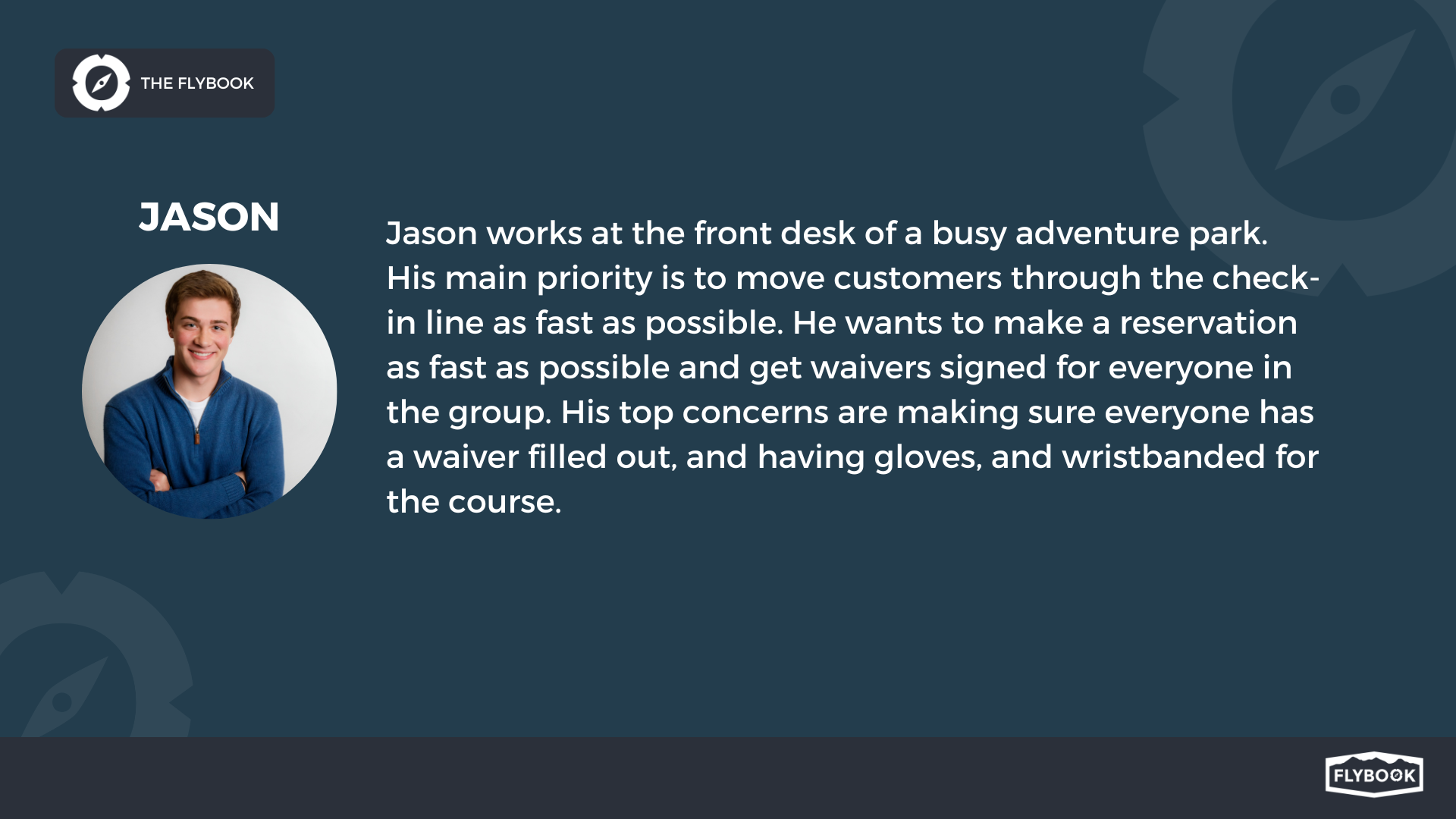
As a high volume operator with majority of walk-up customers we want a fast and simple approach to creating reservations so that we can move as many customers through the door as possible.
Do need to collect customer information.
Want to add an item to the cart, take payment, and print a wristband and/or ticket.
This operator is not limited by availability and their customers are not likely to be repeat customers since they are visiting the area while on a summer vacation.
Design Process
But First, a Side Quest
Before I turn my focus to the Booking Flow redesign, I had to address a small improvement that came out of my research. Through the survey and interviews I discovered waiver signing was the bottleneck of the check-in flow for many high-volume customers. By speaking to some of these operators I also learned that having a customer sign a waiver first before speaking to anyone was the most efficient workflow. However, the software didn’t support a fluid process.
Streamline the Waiver Process
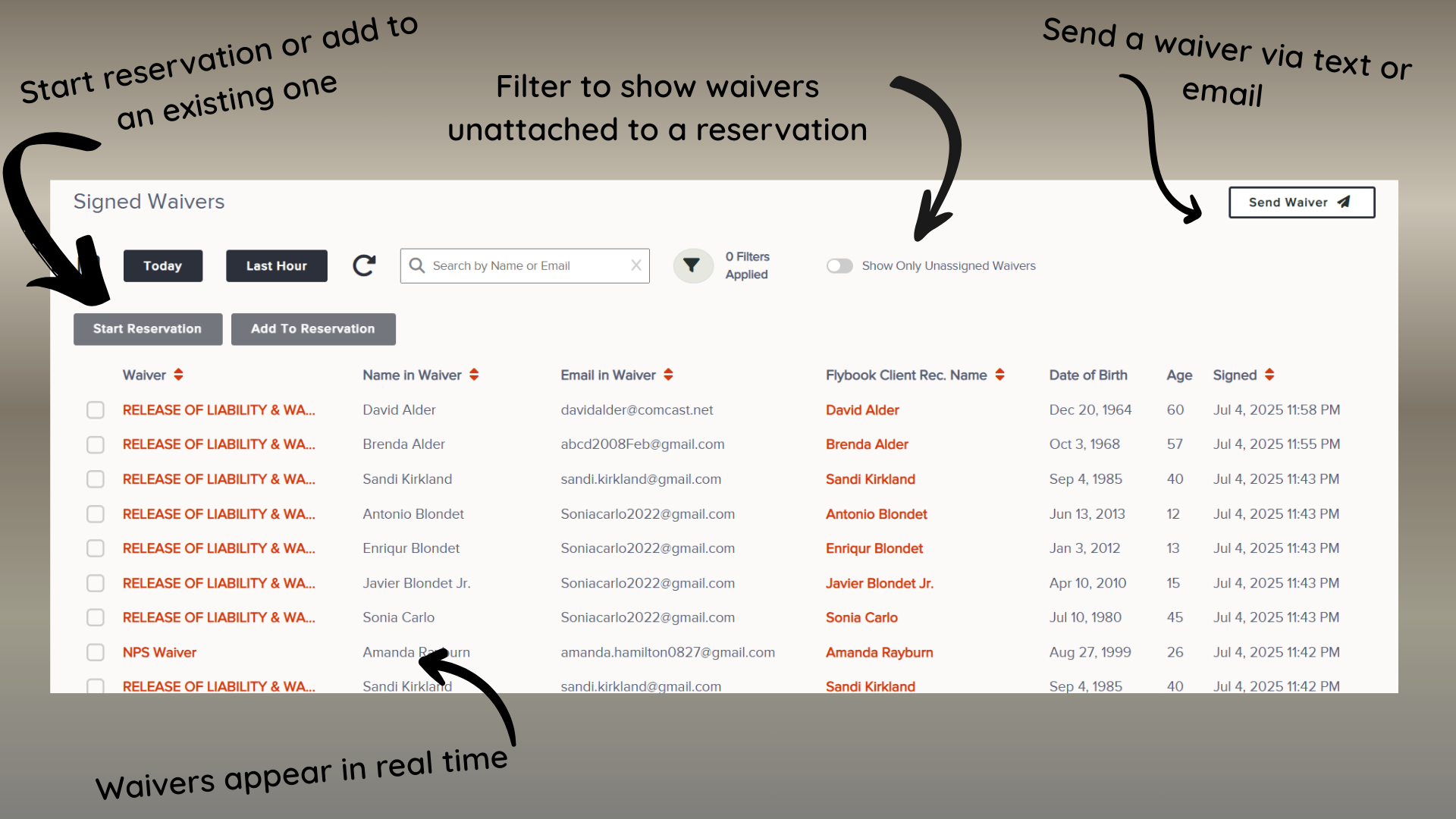
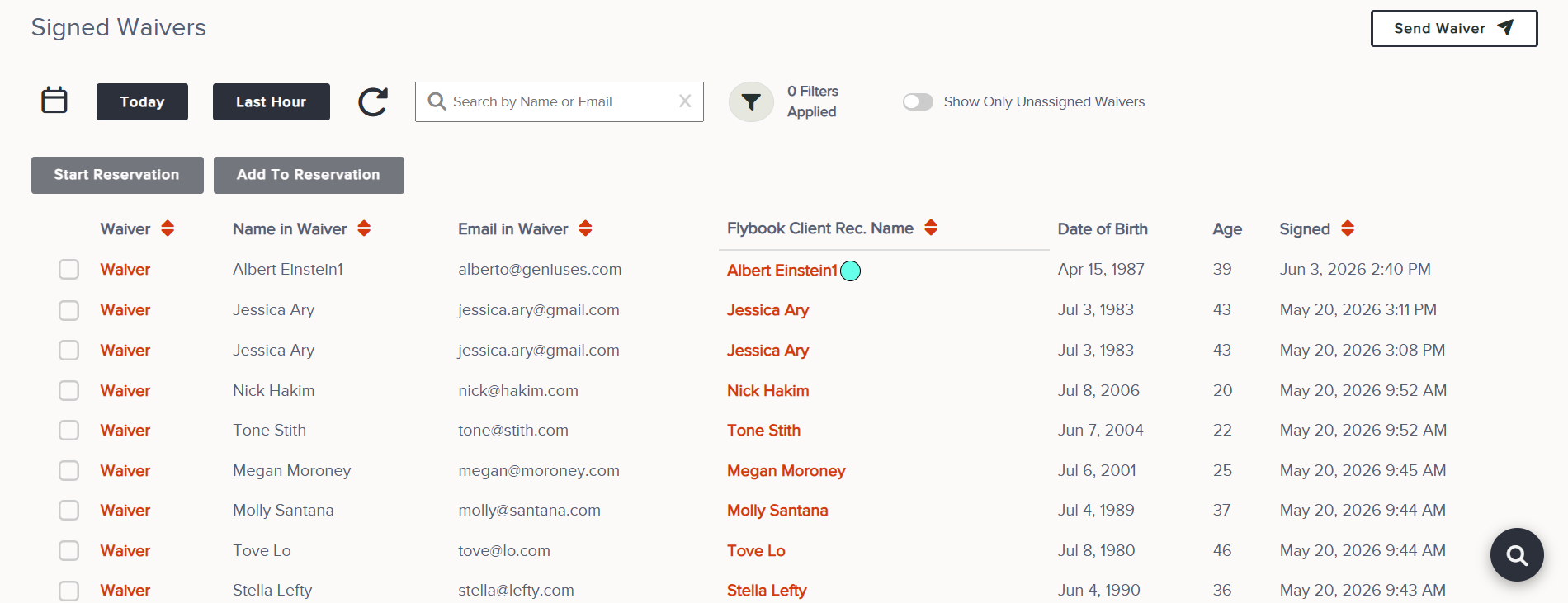
A waiver dashboard already existed, but it was missing some key features to provide an efficient check-in process. With a small effort this dashboard could completely change the operations of high-volume operators. Updates included:
Waivers appear in real-time as they’re filled out.
Ability to select waivers to either create a reservation or add to an existing one.
Toggle to hide waivers that have already been assigned to a reservation to reduce the clutter when checking guests in.
Creating a streamlined waiver process allowed us to be prescriptive with operational workflows for improved efficiency.
Simplicity & Complexity
Flybook is designed to handle the most complex reservations for large groups with many different items in the cart, as well as, additional tools to help with these reservations such as questions, agent bookings, and editing invoicing. While the system does a great job at addressing these complex reservations, it lacks the simplicity for quick walk-up reservations that only need a few steps, for example, collect waivers, add items to the cart, take payment.
So, how do I create a workflow that can handle complexity and simplicity?
The survey was targeted to accounts with a high volume of walk-up customers. The results revealed that although these operations appear to be similar, the walk-up flow varied between the accounts. Flybook is built on providing operational flexibility and that is a huge benefit that I wanted to include with this design.
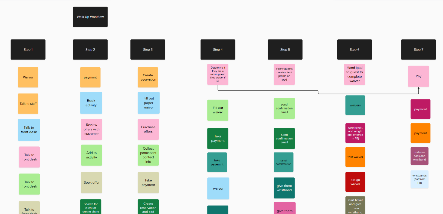
I knew I needed to create a customizable experience that could meet the needs of each operator while still providing complete operational flexibility
Make it Customizable
There are two aspects to creating this customized experience:
The user experience when creating a reservation.
Setting up and building the customized experience.
I started with the user experience since this is the key to a successful feature.
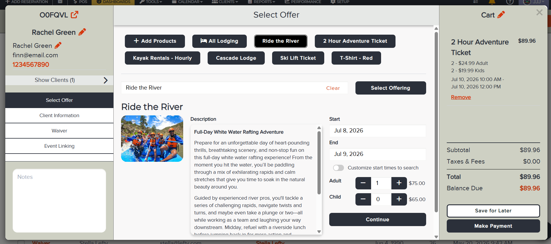
The most important design consideration is ensuring the UI supports customization and allows steps to be removed as needed.
When I’m updating an existing feature I want to know it intimately and will test until I understand every detail
Updated Workflow Combining Steps
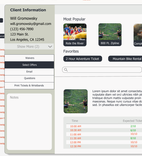
In the updated design, the user has two entry point options: Auto Fill & Guided Selection. Auto Fill will add all package items and end the workflow.
Reservation User Experience
I had defined all of the essential steps to create a reservation from my research. By default all of these steps would appear in the booking flow, but I wanted the option to remove any of the steps and reorder them without a negative impact on the interaction or interface.
The solution was actually very simple. The navigation would appear on the left and as steps were added, removed, or reordered it wouldn’t change the size or interaction or the area. The only step required is ‘Select Offers’ since an item has to be added to the cart to create a reservation.
The Setup Experience
The setup proved to be much more challenging. Flexibility creates complexity and that can difficult to interpret into an intuitive user experience. I worked through three iterations of the design and would often consult the engineers. I’ve found when working on complex workflows it is valuable to pull in the engineers early because they often have a great approach and insight into ways to simplify and avoid over engineering.
Version 1
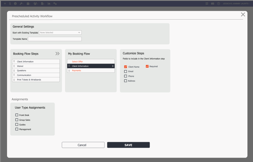
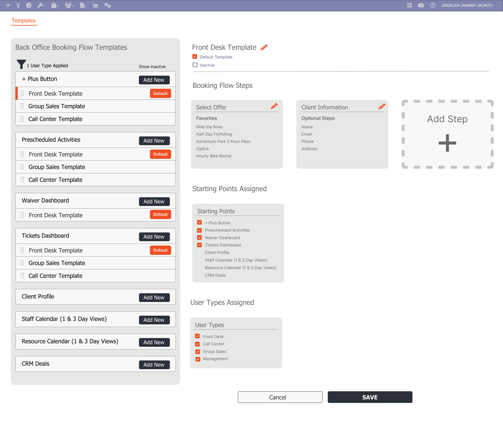
The concept of this design was to drag the booking flow steps from one box to another to build the order and steps. There is also a second layer of customizing what appears in each step.
The act of moving the steps wasn’t intuitive and the step customization was a bit clunky.
Bundles
Version 2
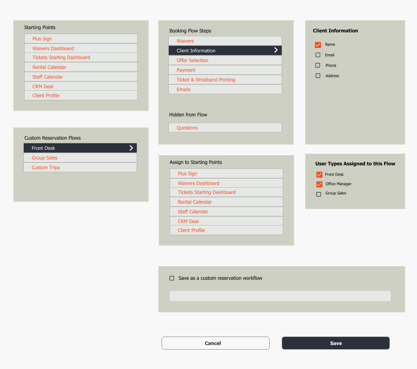
This is a slightly more refined version of the first one. Now the drag and drop stays within the same container and can be dragged to a ‘hidden’ section. I also added the next layers of complexity - creating multiple booking flows based on user roles & the ability to assign a booking flow to a ‘starting point.’ Reservations can be created from various ‘starting points’ in the system and I wanted to add the option to assign a booking flow to different starting points. For example: group sales may have a starting point in the CRM.
At this stage I had all of the elements I wanted, but it was not obvious to the user how to go about setting up a booking flow.
Improve the booking experience without ballooning the entire project
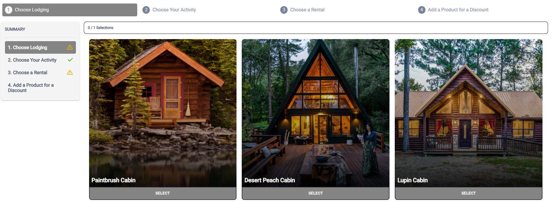
Now that the customization has been solved I can turn my attention to making the overall user experience enjoyable. There are several types of offers that can be booked such as activities, rentals, bundles, and packages. These booking experiences already exist in the current booking flow. While we want to improve the overall experience we don’t have the budget or timeline to overhaul every booking flow, so we wanted to identify the areas that have the biggest impact. So, I turned my attention to Bundles and Packages which are the most complex booking experience since the involve booking multiple offers into one.
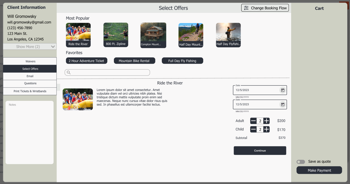
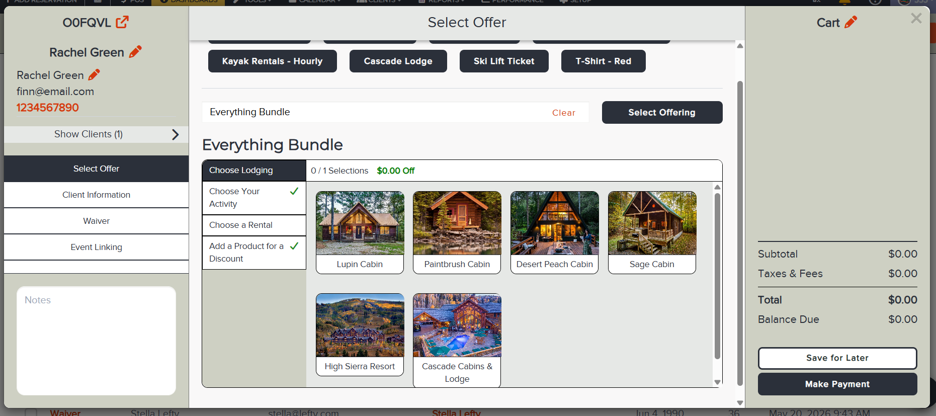
When Bundles were created we were under a tight timeline and didn’t create our ideal booking experience, instead we did the bare minimum at the time with plans to revisit it later. That later was now! We had spent a lot of time creating an intuitive workflow to book bundles online, so my plan was to mimic that experience in the back office as well.
When building in a complex system the value of reusing components and workflows can greatly reduce the lift of large projects and keep the timeline on track
Online Booking Experience
Packages
Simplified version of the online experience
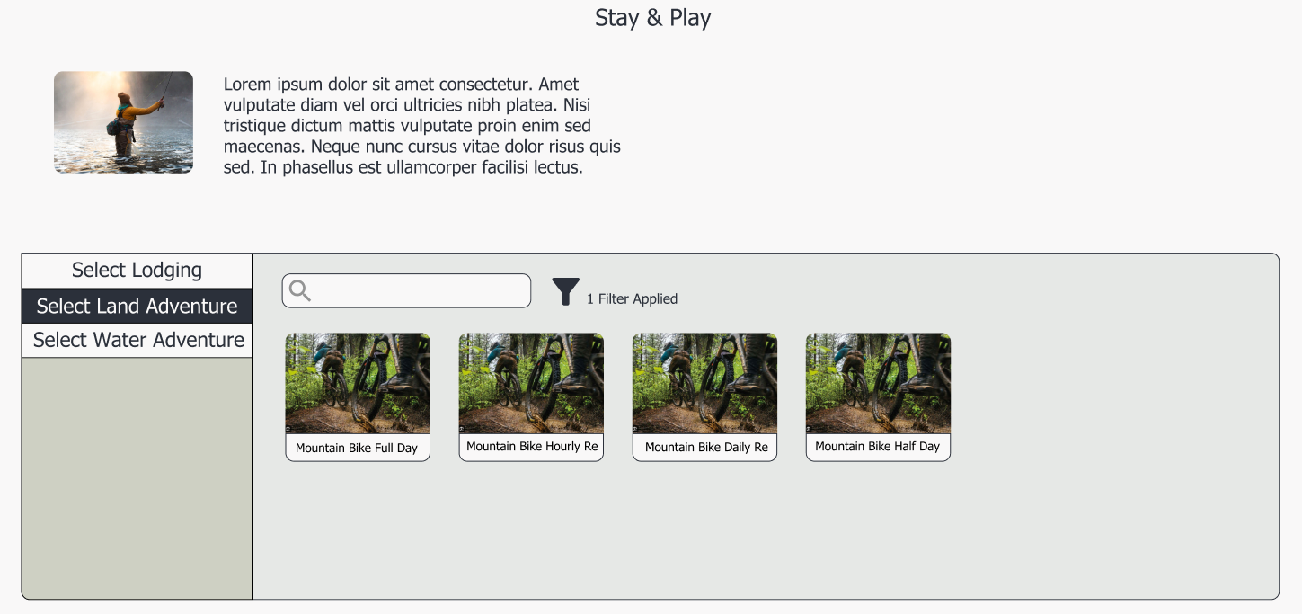
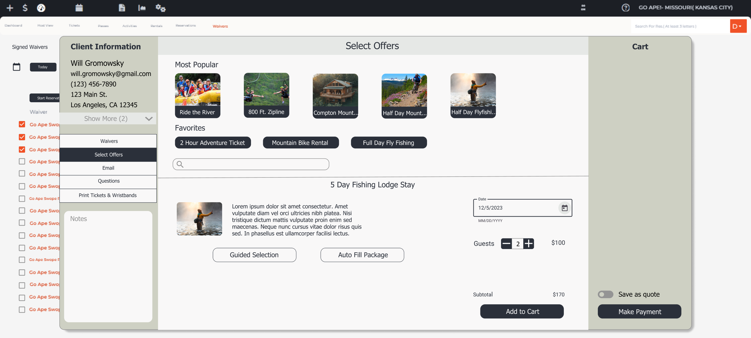
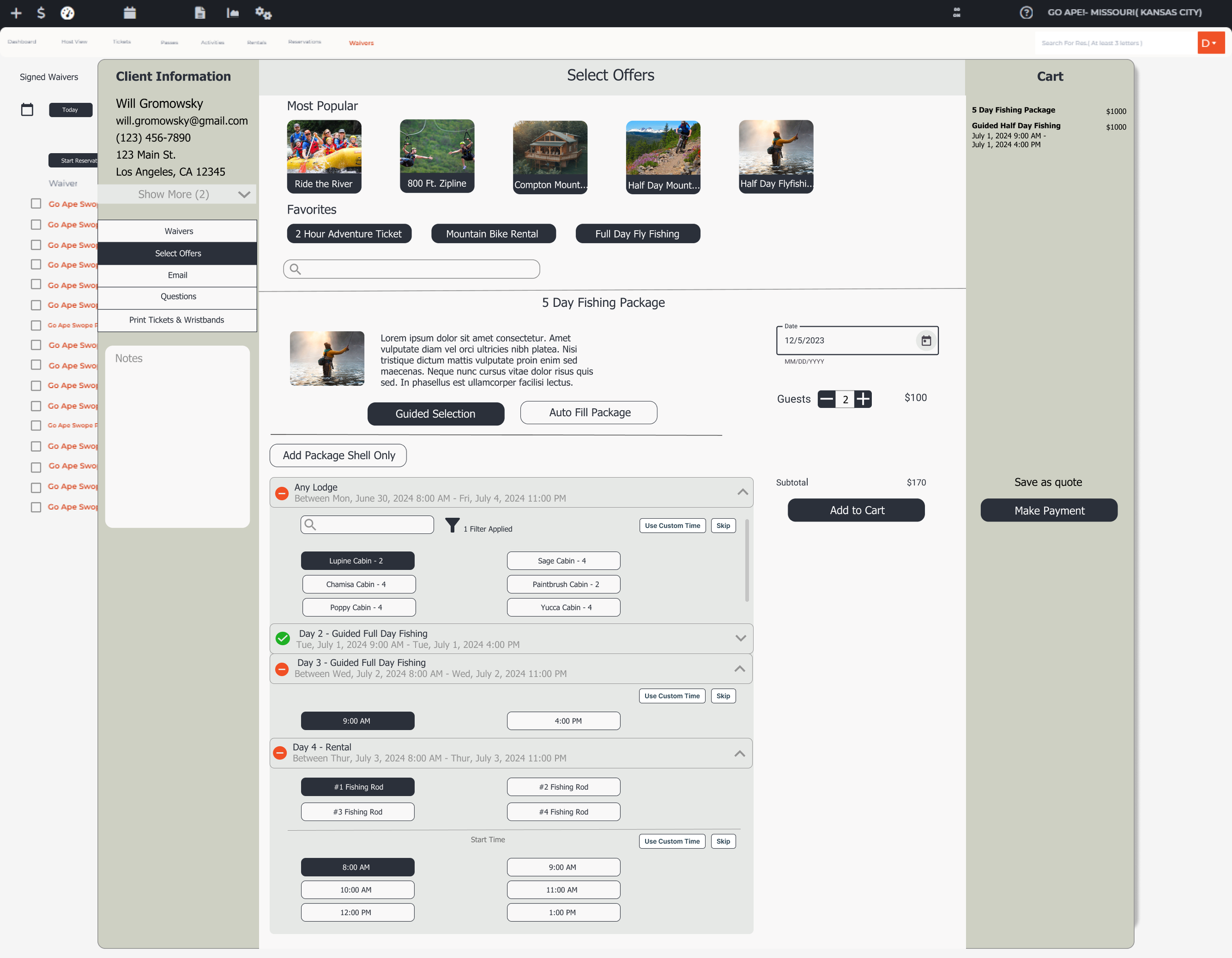
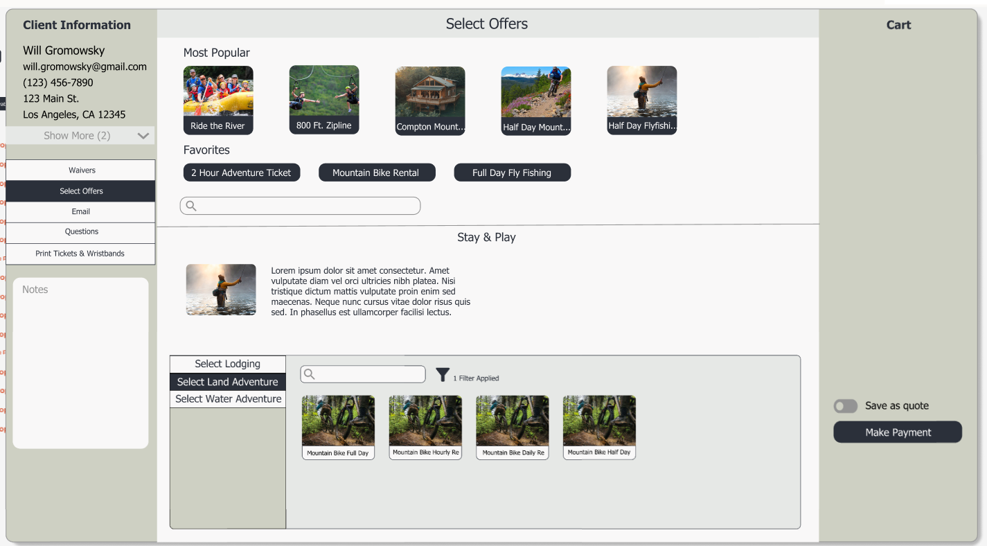
Packages are the most complex offer type to book and one of the features that sets Flybook apart from competitors so it was worthwhile to give this are a facelift. Overtime, functionality had been added to the booking experience which created a clunky experience. There was space to simplify and improve the UX to this area, but first I needed to immerse myself in it to understand it.
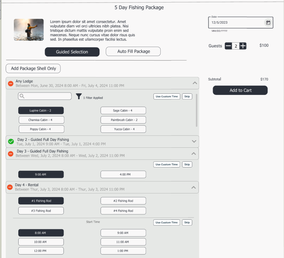
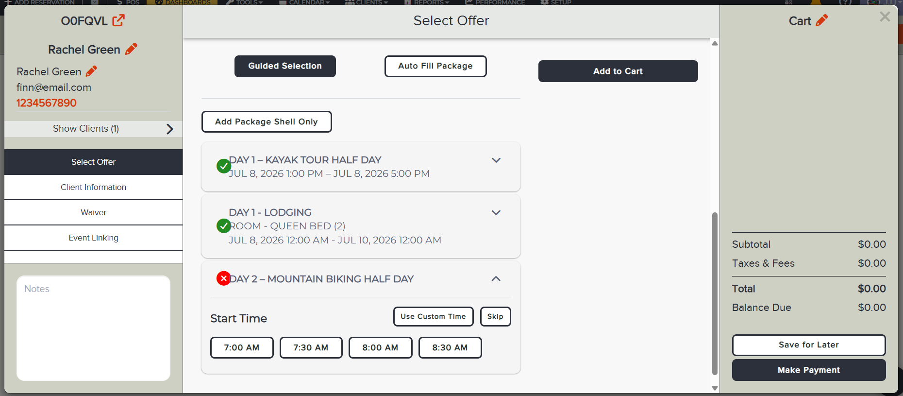
After my testing I identified a key area that combined into one workflow. Packages had three entry points: Add Package Shell Only, Guided Selection, and Auto-Add. The Auto-Add worked great as is, so we didn’t need any updates there. However, ‘Add Package Shell’ and ‘Guided Selection’ could be combined into one workflow. The key difference between these two options was the Guided Selection maintained the start times that had been setup in the Package, while the 'Package Shell route allowed the user to select any day or time for the offers. Why not combine them into one flow?
Once in the Guided Selection workflow the user can choose to ‘Add Package Shell Only’ which will complete the workflow. Otherwise, they can continue to add items to the package with the start times that were setup or they can choose a custom route per item. Previously, they had to go all custom or all programed start times. This new route provides more flexibility.
Version 3
By this point I was feeling stuck. I needed to step away to clear my mind. This is often my approach when I’m hitting a creative wall. I will turn my attention to other projects and do my best to remove my mind from thinking about it. More often than not a great idea will strike me while I’m on my morning run and that is exactly what happened.
I came back to this project with a clear mind and new ideas. Now, each booking flow is created in a template. Each ‘step’ is it’s own container so the customization can live within the step. These steps can be removed and reordered by dragging and dropping. Lastly, the template can be assigned to starting points
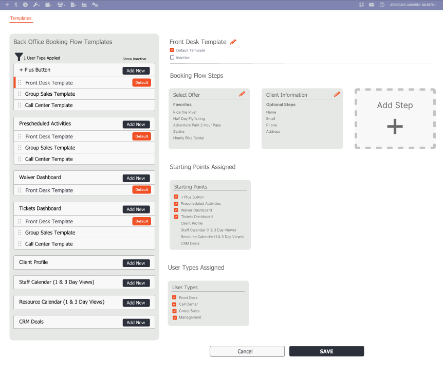
Back Office Booking Experience
Proposal
Update Waiver Dashboard
With a few minor updates, the waiver dashboard can go from an under utilized feature to a valuable asset.
Display waivers as they are signed in real time
Create a workflow to start a reservation from the waivers selected or add to a reservation.
Add filtering to view waivers that haven’t been associated with a reservation to reduce the clutter.
Maintain traditional methods for sharing a waiver such as emailing or texting a link.
Build a New Customized Booking Experience
Starting with the UI
Original Design
Bundle Workflow
Original Design
Package Workflow
Original Design
Setup
Original Design
Final Version
Final Version
Final Version
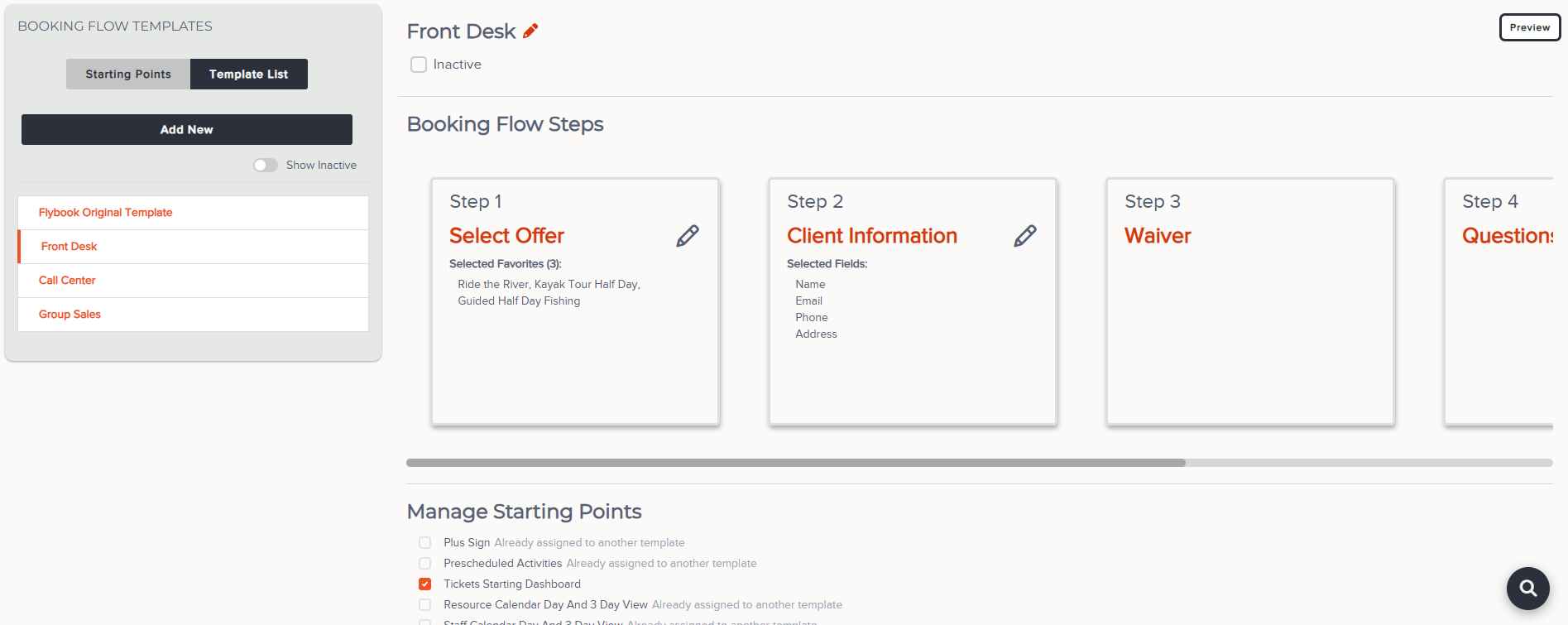
Final Version
Big Win! Waivers Dashboard
Positive Customer Feedback
Tumalo Creek and Kayak - We're doing more sales this year, but somehow it doesn't feel as busy.
Whale’s Tale - moves 500 people every 45 minutes and rely heavily on the waiver dashboard to have a smooth flow. They’ve been able to do more with less staff.
Improved Waiver Dashboard